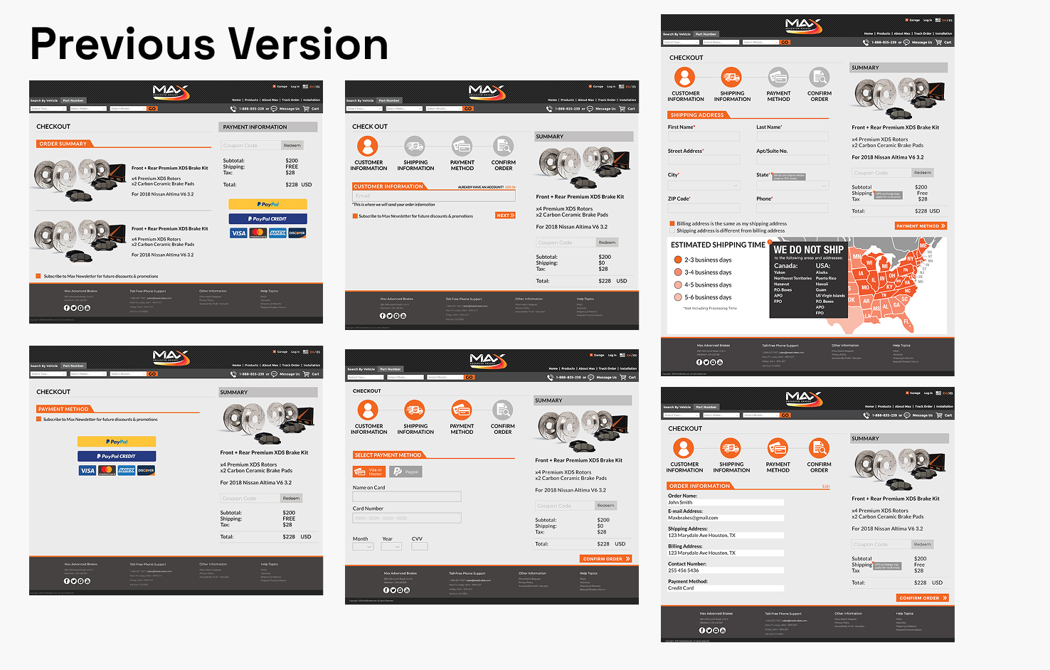
In the previous version of the check-out process, feedback was received that the design was too flat and involved too many elements. Users had trouble between which buttons were clickable and which weren’t.
For the re-design, I conducted research on how top performing retail websites had their check out experience (Nike, Michelin, Walmart etc.). Throughout my research, a lot of the experiences had the same flow and efficiency. “22% of shoppers abandon their purchase due to a long or complicated checkout process.”
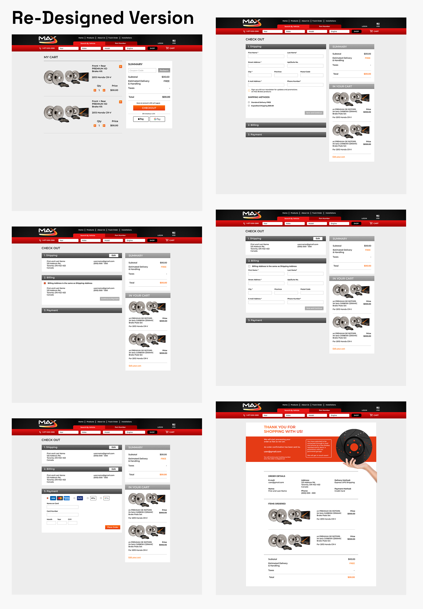
Changed UI by making it modern and depth using gradients.
Streamlined the process, making sure to focus on being easy and efficient.
Adding the “Same Billing Address as Shipping Address” as an element compared to the previous version since this helps quicken the process.
Adding different payment options that had their own user journey before and during the process.